It’s a pity to hide structural elements
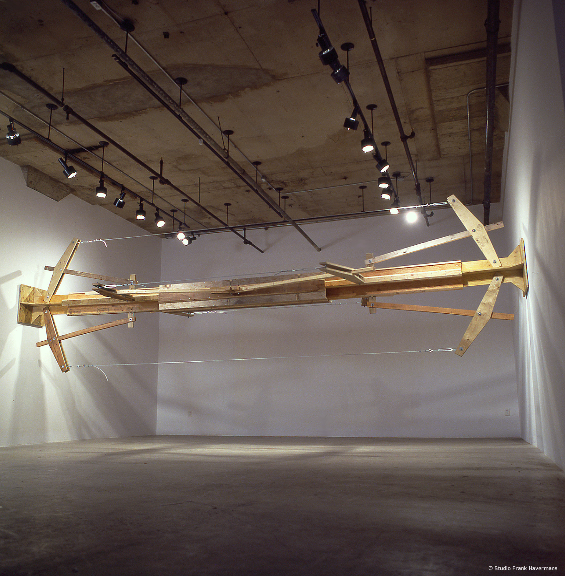
Normally I visit a space if I’m asked to make a work there. I take photos, absorb the space and measure it. This gives me an insight into it’s dimensions, scale and proportions. It’s a set ritual. Since the Clark gallery is in Canada, however, this time I couldn’t just go there and back for a look. The measurements on the floor plan I was sent were in inches. That’s always tricky. I also know from experience that you have to check every measurement on any drawing you’re given. There’s usually a mistake somewhere or the margins are slightly too large.
location: Montréal, Canada
dimension: 656 x 193 x 235 cm
material: construction plywood, steel cables, tensioners, nuts, bolts, screws, cramp plates
venue: Clark Gallery
artist in residence and exhibition: ‘Best Before…’ with Jasper van den Brink, Frank Havermans, Paul van Rijswijk, Pia Wergius
October 16 – November 22
project: Exchange project between De Overslag Eindhoven and the Clark Gallery Montréal
curator: Jacintha Vetter, Marc Niessen
manufacture: Studio Frank Havermans
supported by: NoordBrabants Fonds voor Beeldende Kunstenaars
photography: © Paul Litherland, Montréal
PUBLICATIONS
What I could see on the floor plan was that substantial concrete columns were concealed behind the plasterboard walls. Apparently this was necessary to make the space suitable for the display of art works like paintings and photos. I always think it’s a pity to hide such structural elements. You should actually make a feature of them.
These two factors, my uncertainty regarding the dimensions of the space and the two concrete columns, provided my starting points in the development of this lever construction. Through a number of models I designed a five-piece telescopic structure. This could vary in size with a margin of approximately one metre. The construction was intended to mark the position of the two columns behind the walls. In a kind of inversion of the anchor beam principle, the construction not only wedges itself in position, it also appears to be pushing apart the building from which it derives its existence. Construction and destruction captured in a single image.
In order to achieve this I made a prototype configuration in my studio, in addition to my usual models. Between the studio walls I experimented with the appropriate dimensions and proportions to distribute the forces on the work. Shortly before I left for Canada, the work had just started to hang. In Montréal I made a new improved version in the wood workshop. This remained suspended for six weeks. It suffered from instability and had to be adjusted frequently, particularly during the first few days. Strangely enough, no-one seemed to notice this and everyone assumed that the work was completely stable, as it certainly appeared to be, but nothing could have been further from the truth.


On display at Museum SM’s ‘s-Hertogenbosch in 2011


