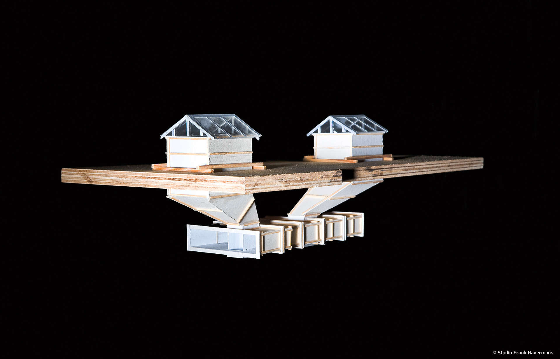
At no point does the installation touch the interior space.
The Argument artists’ initiative is based in the former bicycle shed of an old school in the centre of Tilburg. This relatively small, somewhat tapering space of 15.2 x 6.7 x 2.8 m, with low ceilings, is divided into two sections.
The front section, the entrance, is an office with access through the partition wall into the exhibition space.
year: 2000
location: Tilburg, Netherlands
dimension: 980 x 360 x 425 cm
material: recycled construction plywood, square timber, screws, white lacquer
solo exhibtion: From the Roof Down
organization: Vertoningsruimte Argument
curator: Hans Stevens, Sandra Eijkman
venue: Vertoningsruimte Argument, Korte Schijfstraat
manufacture: Studio Frank Havermans
photography: © Martin Stoop, John Schouten, René de Wit, Sandra Eijkman, Studio Frank Havermans
PUBLICATIONS

The installation is supported entirely by girders on the Argument’s flat roof. At no point does the installation touch the interior space. The light shafts make the installation visible from the outside of the building and bring fascinating, concentrated daylight through the architectural installation into the exhibition space.
The installation hovers parasitically in Argument’s space and uses the concentrated daylight, manifest as beams of light on the floor, as an energy source. Passing clouds cause the amount of daylight to fluctuate considerably: the beams of light constantly increase and decrease in intensity, revealing more or less of the installation.
The first things that struck me were the two sizeable skylights of 2 x 1 m through which the only daylight entered. These provided the direct inspiration for the installation. The space appears more interesting on the floor plan than it is in reality, which is why I decided to place another, more exciting space, derived from the same floor plan, in the exhibition area. As you only experience the interior space, I took no account of the exterior space. Working from the floor plan and the elevations, I manipulated the proportions to create a design for an architectural installation on a scale of 1:2 in the floor plan and 1:5 in height.
The white interior space of the installation refers to the Argument’s interior space. The outside is construction, based on the standard sizes of the sheet material I used. I placed this installation in the middle of the exhibition space. Then I connected the skylight openings in the exhibition space with the corresponding openings in the installation, creating two structural perspective shafts. Both extended a meter beyond the roof and were topped by the original skylight windows.


